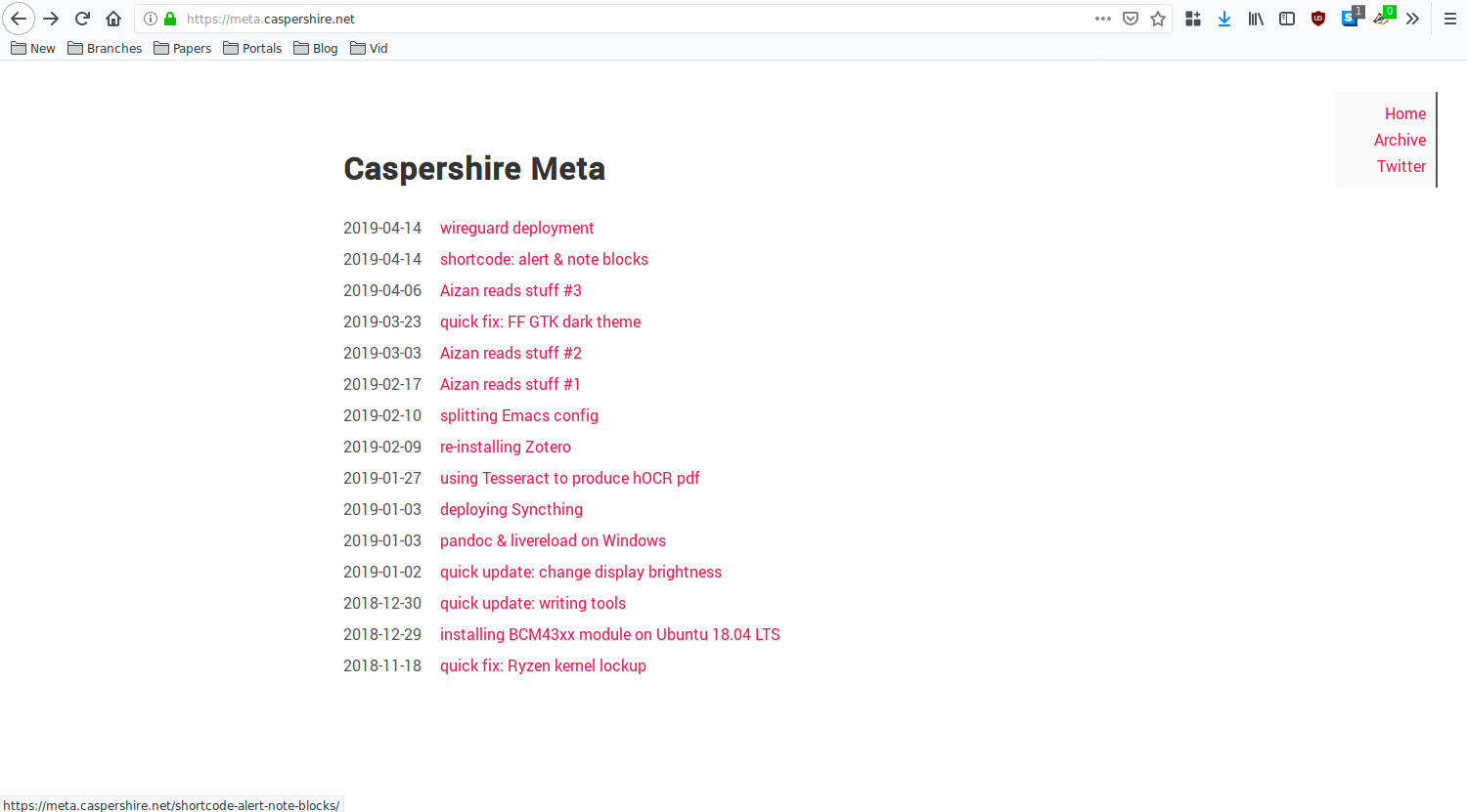
How was your weekend? Mine was good. I spent about 3 hours writing a new theme for Caspershire Meta.
I did not plan to write my first Hugo theme at all. It just happened because I stumbled upon a thread on Hacker News, Show HN: Web Design in 4 minutes. Note that this is not my first first attempt at writing a theme for Hugo-based SCG. A somewhat similar attempt had been made a few weeks back with the auxiliary goal of learning Tailwind CSS framework.
But, that Tailwind plan did not quite fly. The project sat dormant for a few weeks, eventually dug its own grave.
After spending time going through Web Design in 4 minutes, I felt that this thing hugged me so hard as if I was gasping for air and the way out was to actually write a theme based on that guide.
I did. I effing did it.
And I think Caspershire Meta now looks kind of glorious.

As I was writing minimal4 (the theme’s name, because it is minimal and came from that 4 minutes tutorial), I set a few goals: avoid Javascript if at all possible (because my roommate has NoScript on his browser), LOC for CSS should not reach 200 but maintains verbosity, and viable enough on mobile.
I think I checked all the boxes. And I even added small animation for hovering hyperlink!
But of course, minimal4 v0.1 not perfect. I implemented a very basic navigation (top right, only visible on large screen), pagination does not exist (probably won’t) because the logic confuses me, and the image bleed through has to be fixed as well. minimal4 does not even have a grid system as of this version.
But, I am satisfied enough. I am thinking to use minimal4 for Caspershire but with a different color scheme. Dark purple, maybe?