Recently I had to process ~200 human PBMC samples by flow cytometry for an immunophenotyping project. Usually, a flow cytometry experiment poses no problem, but particularly for this project I had to query for rare events. My population of interest, rare antigen-specific memory B cells (defined as live CD3–CD19+CD27+Probe+), usually in the neighborhood of 100 events per million events in healthy donors1. This was where things get difficult, not in term of science but in term of logistics. This is very typical of a common PhD trajectory as a candidate progresses: problems mostly coming from trying to scale things up because time is running out.
The experiment was completed successfully and analysis is currently underway. Well, analysis is always an on-going process anyway, only stopped when there is enough to convince reviewer #2.
Table of Contents:
- The Experimental Setup
- Dealing with Batch Effect
- Too Many Data Points?
- Charting the Uncharted Territory
- Reflection
- Code for Drawing Ridgeline Plot
The Experimental Setup
The experiment was split longitudinally into 7 separate runs at roughly 32 samples per run. A typical session (comprised sample preparation and staining) took me 7 hours, starting from getting the samples out of cryopreservation, counting them (for normalizing the input stain size), aliquoting cells, staining itself, and fixation.
Acquisition was performed on a full-spectrum 4-lasers Cytek Aurora, which gave me sweet advantages over traditional flow cytometers: (A) no compensation control setup at each run (shaving off 40 mins per run); (B) flexibility in panel design (because it is a full spectrum cytometer); and (C) high flow rate with low abort rate, i.e. 8,000 events/sec flow rate with 400 events/sec abort rate. Even better, the experiment layout can be designed using Cytek’s online Experiment Builder tool and later imported into SpectroFlo on the cytometer machine, therefore shaving off another 10 – 15 mins at the cytometer machine.
Dealing with Batch Effect
When I cheerily mentioned to the members of my thesis advisory committee that I had around a few hundred more samples to run to complete my thesis project, I heard a collective worried expression from them, and immediately one asked if I accounted for potential batch effect. For the experiment itself, steps were already taken to minimize batch effect, e.g. only 1 experimenter, only 1 machine, same lot of buffers throughout, samples were run not in any particular order of treatment, etc.
Practically, how does one measure the batch effect? Cytek Aurora posted a web article on this topic and it seems to boil down to 4 methods: (#1) using bridge (a.k.a anchor) samples that are present for all runs so one could produce a Levy-Jennings plot; (#2) performing dimensionality reduction to detect weird or uneven clustering; (#3) using a more quantitative approach with certain algorithms like Harmony and iMUBAC as mentioned in the linked article above; or (#4) plot histograms2 of single channels overlaid by batch and then checking for pattern(s) indicating batch effect.
I could not use solution #1 because I did not include bridge samples3, solution #2 is computationally intensive4, solution #3 is technically solution #2 but with publicly available packages. That leaves me with solution #4 (which I conveniently had it last on the list above), but even then there were some difficulties here.
So, batch effect be damned and it was now standing between me and my thesis manuscript.
Too Many Data Points?
48 million events from a batch of 32 samples, that is a disgustingly huge number5. Now, multiply that number by 7 for 7 batches. My current language of choice is python, and now I could imagine pandas6 would suffer. But, there is no shortage of alternatives for dealing with huge data in python. We have Dask, Vaex, and Polars7, to name some of the popular ones.
It is probably useful to think about the preferred structure of the final dataset for analysis. Maybe something like this would work?
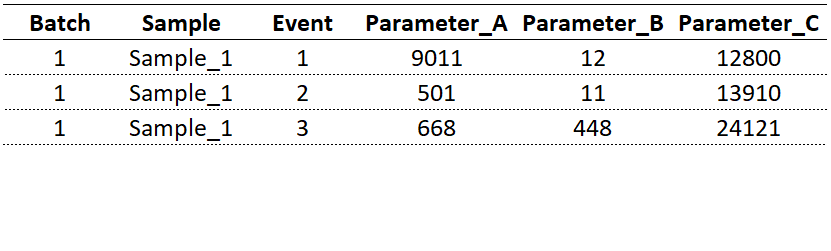
Consider the tabular data above. Each data point is identified by its batch number, sample ID, event number, and (fluorescent) parameter of interest. With regard to my analysis, the intent was to track all markers crucial to my analysis, e.g. CD19, CD3, CD27, to name a few. How do we get to this format from flow cytometry standard (FCS) file8?
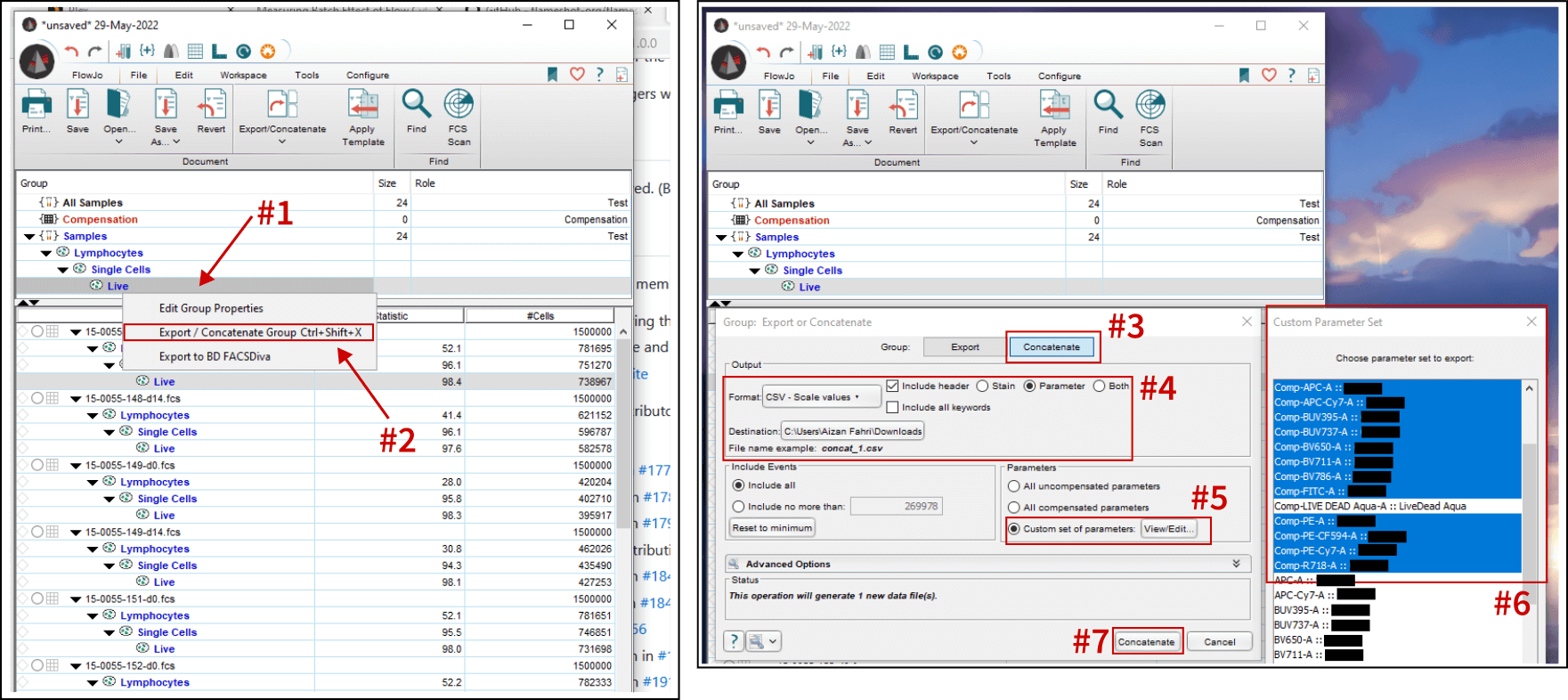
Screenshot above shows the workflow for exporting concatenated CSV files of select parameters from a live cells gate. Follow the steps below:
- Ensure the appropriate gates (lymphocytes, single cells, and live) are drawn and applied to the whole group. Then, right click on the group-level Live gate.
- Click on “Export / Concatenate Group” menu.
- Select “Concatenate” tab to export all samples as a single file. If “Export” is chosen, each sample will be exported as individual CSVs. This could be useful, i.e. gathering sample-specific parameters if each sample was sufficiently labeled.
- For the format, I am going with “CSV - Scale values”9. For the header options, I chose “Parameter” instead of stain name10.
- Select which parameters to include.
- Basically selecting the parameters one-by-one. Live/Dead stain was not included because dead cells were gated out.
- Export!
Then, read the .csv as Polars DataFrame.
# Import polars
import polars as pl
# Read data as df
df = pl.read_csv("concatenated/batch_1.csv")
# Add column for batch sequence ID
# Using .with_column and pl.lit().alias() calls
df = df.with_column(pl.lit(1).alias("Batch"))
# See head and tail
df.tail()
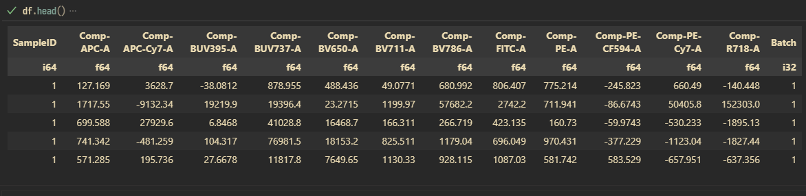
df.head()
# Print dimension
x, y = df.shape
print(f"This dataset contains {x:,} rows with {y} columns")
For 1 batch of experiment (run #1 with a total of 24 samples for the pilot experiment), I got back 14,632,176 rows of data (~580,000 events/sample after cleanup gates), each with 12 fluorescent parameters.
Each sample within a batch is given a sample ID, 1...n sequentially.
This is great. Time to concatenate the rest of the runs. I guess it is time to think how to store the whole thing because CSV might not be the best way to move forward11. Total size of all CSVs is 13.1 GB. Storing the concatenated (all batches) as Apache Parquet file with zstd compression yielded a final file size of 6.32 GB.
# Concatenate and write onto disk as Parquet file with compression enabled
# Using pl.concat() followed by .write_parquet()
# This operation took less than 20 min to finish on my laptop (16 GB, Ryzen 7 (3xxx series), SSD)
df_all = pl.concat([df_1, df_2, df_3, df_4, df_5, df_6, df_7], rechunk=True).write_parquet(file="batch_all.parquet", compression="zstd")
Total rows: 133,624,523. Are we doing big data yet, son?
Charting The Uncharted Territory
Getting data into a suitable format for painless retrieval was quite an ordeal, but now here comes more pain: how to plot them in a way that they make sense. Let me show you how the data would look like if we were to plot them without applying another round of plumbing12:
# Subset data from batch 1, then return as pandas DataFrame() for Seaborn to plot
df_subset = df.filter(pl.col("Batch") == 1).to_pandas()

# Plot using kernel density estimation (KDE) plotter
sns.kdeplot(data=df_subset, x="CD3")
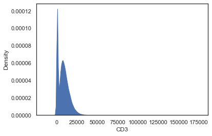
Oh yes right, biological stuff typically present on logarithmic scale, hence a log-transformation is needed.
Calling np.log10 through pd.DataFrame’s .apply() method as a lambda function should fix this13.
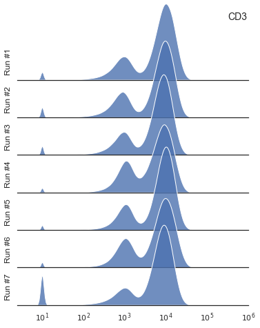
A quick reminder that Seaborn visualization library is not particularly fast.
To plot all data points using sns.kdeplot() would take quite a bit of time, hence a sub-sampling step is required.
Sampling about 5% – 10% (from a humongous dataset) is probably appropriate.
Reflection
I started my grad school with an unhealthy amount of paranoia14, amounting in the form of fear that my experiments would yield uninterpretable results. As I progressed along, I adopted the belief that there is no such thing as failed experiments, only unanalyzed data. The key for being able to analyze data comes in the form of the use of biologically meaningful controls and good experimental conducts15.
Over the time, having done the same assays for multiple times, I developed my own personal criteria to judge the validity of an experiment. For some assays, reproducibility (usually with the help of bridge controls) is deemed acceptable if deviation hovers around 10%16 between assays that were run on different days. This is to say that grad school requires a lot of work, but that’s not enough. It also demands a lot of attention to fine details17.
Code For Drawing Ridgeline Plot
Code block down below is intended to run on VS Code with IPython and ipykernel present.
# %% ---------------------------------------------------------------------------
import polars as pl
import seaborn as sns
import numpy as np
import matplotlib.pyplot as plt


# %% ---------------------------------------------------------------------------
df = pl.read_parquet("batch_all.parquet")


# %% ---------------------------------------------------------------------------
# Ridgeline plots for multiple runs, function definition
def ridgeline_plotter(ax=None, marker="CD3", fraction=0.001):
    """
    """
    for _batch in [1, 2, 3, 4, 5, 6, 7]:
        # Extract data from specific batch with sub-sampling, return as pandas DataFrame
        _df_subset = df.filter(pl.col("Batch") == _batch).sample(frac=fraction).to_pandas()

        # Set lower values and apply log10 transformation
        _df_subset[marker] = _df_subset[marker].apply(lambda x: 10 if x < 9.9 else x).apply(lambda x: np.log10(x))

        # Plot with .kdeplot (slow!)
        sns.kdeplot(ax=ax[_batch - 1], data=_df_subset, x=marker, fill=True, alpha=0.8,
                    linestyle="-", linewidth=1, edgecolor="white", clip_on=False)

        # Customizations for all
        ax[_batch - 1].text(s=f"Run #{_batch}", x=0.1, y=0.1, rotation="vertical")
        ax[_batch - 1].set_xlim(0.4, 6)
        ax[_batch - 1].spines[["top", "right", "left"]].set_visible(False)
        ax[_batch - 1].set_xticks([])
        ax[_batch - 1].set_xticklabels([])
        ax[_batch - 1].set_ylim(0, 1.25)
        ax[_batch - 1].set_yticks([])
        ax[_batch - 1].set_yticklabels([])
        ax[_batch - 1].set_ylabel("")
        ax[_batch - 1].set_xlabel("")

    # x-axes ticker for the final axes
    # Label is drawn with scientific notation (using math mode)
    _range_tick = [1, 2, 3, 4, 5, 6]
    ax[6].set_xticks(_range_tick)
    ax[6].set_xticklabels([fr"$10^{x}$" for x in _range_tick])

    # Marker as title
    ax[0].text(s=marker, x=5.5, y=1, fontsize=14, fontweight="medium")


# Enable transparency when overlapping
sns.set_theme(style="white", rc={"axes.facecolor": (0, 0, 0, 0)})

# Draw canvas and set height spacing
fig, ax = plt.subplots(nrows=7, figsize=(6, 8))
fig.subplots_adjust(hspace=-0.5)

# Draw plot with the specified sub-sampling fraction
ridgeline_plotter(ax=ax, marker="CD3", fraction=0.1)
This code was executed successfully on a laptop with 16 GB RAM and a quad-core (4C8T, AMD Ryzen 7 3750H) CPU.
-
For a typical flow experiment, 50,000 – 500,000 events are collected, assuming the population of interest is abudant. However, concerning rare antigen-specific populations (e.g. B cells with BCR reactive to fluorescently-conjugated protein or antigen-probe), the math and the universe are both unforgiving to this poor grad student. I had to collect roughly 1.5 million events per sample. Had I done this on geriatric LSR, the slow flow rate would have pushed my graduation further. ↩︎
-
Technically, not a histogram. Technically, histogram refers to stack of rectangles. Kernel density estimation (KDE) is the accurate term for, what some people might call, the smoothed histogram. ↩︎
-
Before you disparage me, consider that I was working on precious and stupidly expensive-to-acquire human blood samples. Making matter more interesting, I had one shot for each of the samples. ↩︎
-
If using un-gated populations of 1.5 million events per sample, for ~200 samples in 7 batches… this is going to take a few hours or maybe days on my laptop. I could down-sample though, but still it would take long. Ideally, I want my analysis per marker to be completed within minutes. ↩︎
-
An Excel worksheet has a maximum limit of 1,048,576 rows by 16,384 columns. Big data is clearly where MS Excel will not… hehe… excel at. ↩︎
-
Currently, pandas (with its
pd.DataFrame) is the de facto standard for working with structured data in python. ↩︎ -
“It is the last one on the list, it must be it, right?”, LOL yep, and partly inspired by Alec Stein’s write-up, Why nonprofit hospitals can be so damn expensive. Also, because I am interested in Rust and the on-going oxidation the software world, I consider this approach unresistible. ↩︎
-
If I were to stay true to my nature, I would have chosen to over-engineer the solution for
poops and gigglespersonal satisfaction. But, time is unkind to such endeavour. I had choose the conventional method with FlowJo. Had I chosen to go with a programmable route, the next question would be on choosing the parser for reading FCS files. I found 3 open source packages: fcsparser, FlowCal, and FlowKit. I was considering FlowKit simply because of its rich features. In the past, I tried CytoExploreR and was considering to try openCyto on R. The benefit of going conventional (with FlowJo) is that I could export data from lymphocyte, single, and live gates. This cut down the total events quite significantly, as I later explained in the main text. ↩︎ -
There are two outputs for CSV: Scale values and Channel values. Scale values are untransformed values produced by the cytometer, while Channel values are log-transformed. Everything in FlowJo is done with Channel values. I decided to go with Scale values because I would like to work with raw untransformed values for identifying batch effect. This means that a value transformation pipeline is required when visualizing the data. ↩︎
-
Because I made a mistake in an experiment where, for some reason, the stain names were not registered. I blame Experiment Builder for that. ↩︎
-
While CSV is great, my impression is that it is not designed for holding a stupidly huge amount of data. From 1 concatenated batch, the output CSV was at 1.36 GB. My current understanding is that for storing big data on disk, the recommended method is to use Apache Parquet file format. ↩︎
-
Some call data transformation process as data wrangling. I would prefer the term “data plumbing”. Plumbing here indicates something is leaking, which best describes my sanity upon doing this experiment. I am surprised that I still have some left. ↩︎
-
Sorry for the jargon. Apparently, plotting on Polars DataFrame does not quite work, so converting into a Pandas DataFrame is the way to go. Ensure that
pyarrowis installed. Also, ridgeline plot is my favorite when coupled with kdeplot to visualize overlapping densities. ↩︎ -
Yes, there is a healthy amount of paranoia, usually in the form of well-crafted experimental design and controls of many kinds. ↩︎
-
Translator note: stellar organization, excessive notekeeping, legible handwriting, and spreadsheets…. lots of spreadsheets. ↩︎
-
It depends on the assay sensitivity. For lousy assay with a lot of noise, maybe 20%. For assay with clean output, maybe 5%. If you were to graduate from the US Army Sniper Course, you need a 5% precision. Unsure why you need to know that. ↩︎
-
There is a laundry list of factors, ranging from luck to the meal that you had for dinner the night before an experiment. But I am not here to scare prospective grad students. Or maybe I did that already. ↩︎